
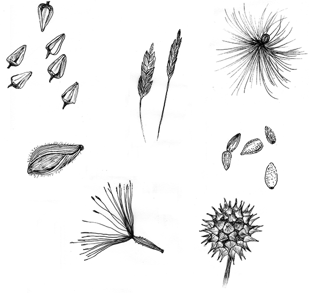
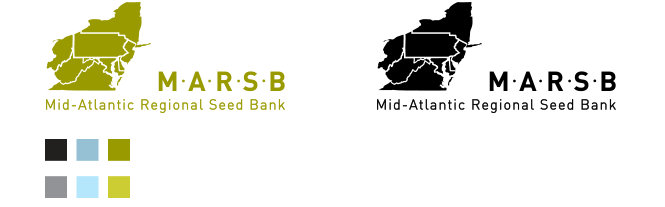
Several iterations of the MARSB logo were developed based on seed. However the idea to go with a map of the Mid-Atlantic region seemed most appropriate as it did not compete with the rest of their graphic imagery which largely consists of seed.
Share