About Graphs & Charts
How content, especially complex content, is displayed visually impacts how likely we are to make an effort to understand what we are looking at. This post, written for my Information Design students at City Tech, explores the potential for using charts and graphs to effectively tell compelling stories.
There are a number of well-established models that are important to understand when visualizing information. These models have evolved over time and are meant to help organize and structure quantitative information through graphic representation in ways that make concepts easier to understand.
1. INFORM
Convey a Single Data Point

There is no one single way to visually describe any given problem. The goal is to find a good one. As an example, the images above show three different representations of the same information.
2. COMPARISONS
Categorical Data

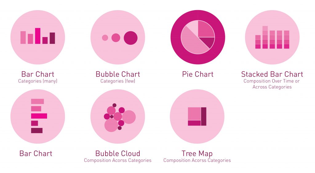
The pink charts are good for comparing different quantities of data. If you have categorical data (distinct data) that you need to compare, these charts display how they match up side by side. The Bubble Cloud Chart and the Stacked Bar Chart are examples of charts that show multiple data points. For example in the Stacked Bar Chart, each bar represents a whole, and segments in the bar represent different parts or categories of that whole.
3. TRANSFORMATIONS
Showing Transformations Over Time or Via Location

The charts in blue are used for showing and comparing data that is continuous. Line charts display this type of information nicely and can also highlight transformations over time or pin point differences between locations.
4. ORGANIZATION
Arranging Content by Groupings, Rankings, or Process

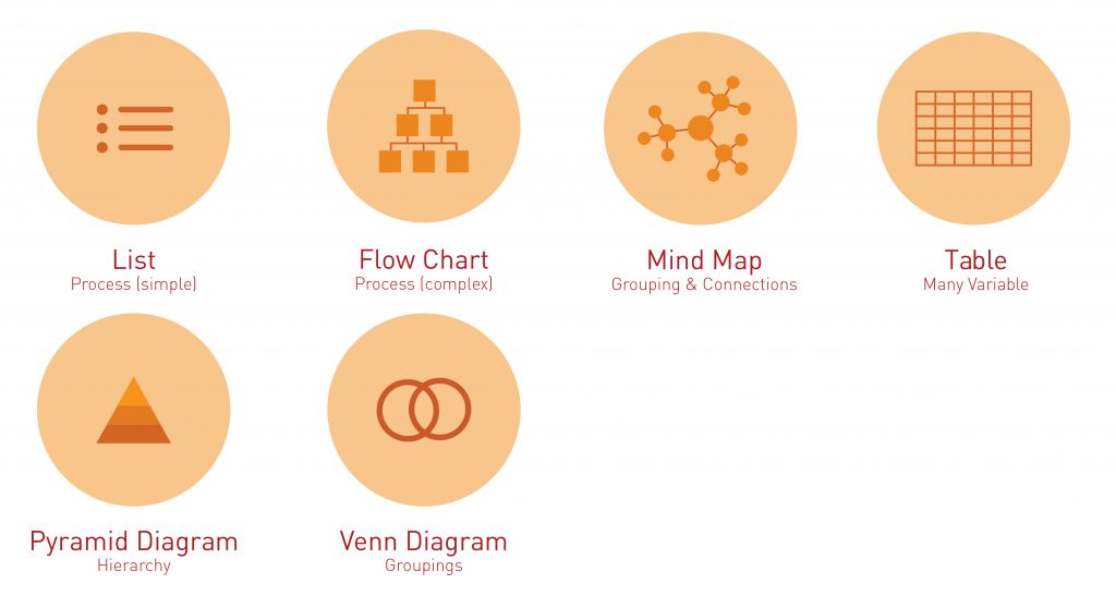
The orange charts are just a few examples of the many different ways information can be organized and categorized to help make if more accessible to viewers. These charts help to establish visual hierarchy so that the eye can more efficiently scan and make sense of content heavy data through structure, groupings, and connections.
5. IN SUMMARY
More Detailed Categories
A. Lines – Continuous Data
- Classic form
- Show trends
- Good for comparing over time
- Continuous data
Common mistakes: Unnecessary legends, 3D, correlations not causation
Line Charts examples:
- Temperature (70º 90ºF)
- Stock market prices ($8 $9)
- Weight (90 120 lbs)
- Age (30-40 years old)
B. Bars – Categorical Data (Distinct Data)
- Classic form
- Precise comparisons
- Distinct data
Common mistakes: Non zero baselines, random ordering of items
Bar Charts examples:
- Countries (USA, Russia, China)
- Beetles (LadyBug Beetle, Japanese Beetle, Dung Beetle)
- Colors (Pink, Purple)
C. Bubble & Pie
- Parts of a Whole
- Use sparingly
Common mistakes: Too many pieces in a pie chart, complex legends, Not adding to 100%
D. Scatterplot
A scatter plot (also called a scatterplot, scatter graph, scatter chart, scattergram, or scatter diagram) is a type of plot or mathematical diagram using Cartesian coordinates to display values for typically two variables for a set of data. If the points are coded (color/shape/size), one additional variable can be displayed. The data are displayed as a collection of points, each having the value of one variable determining the position on the horizontal axis and the value of the other variable determining the position on the vertical axis. (wikipedia)
- Showing relationships
- Individual data points
Common mistakes: Drawing dubious conclusions, Not adding a trend line
E. Treemaps & Sunbursts
Treemaps display hierarchical (tree-structured) data as a set of nested rectangles. Each branch of the tree is given a rectangle, which is then tiled with smaller rectangles representing sub-branches. A leaf node’s rectangle has an area proportional to a specified dimension of the data. Often the leaf nodes are colored to show a separate dimension of the data. (wikipedia)
- Parts of a whole
- Complex divisions
F. Waffle
Waffle Charts, also called Square charts, are a form of pie charts that use squares instead of circles to represent percentages.
- Parts of a whole
- Showing composition
G. Small Multiples
A small multiple (sometimes called trellis chart, lattice chart, grid chart, or panel chart) is a series of similar graphs or charts using the same scale and axes, allowing them to be easily compared. It uses multiple views to show different partitions of a dataset. The term was popularized by Edward Tufte. (wikipedia)
- Repetition
- Compare small changes
H. Maps & Cartograms
A Map chart allows us to visualize spatial relationships in data by indicating data on a geographical map. There are two main types: 1. Geographical Points and 2 Geographical Areas. (wikipedia)
A cartogram chart is a map in which some thematic mapping variable – such as travel time, population, or GNP – is substituted for land area or distance. The geometry or space of the map is distorted, sometimes extremely, in order to convey the information of this alternate variable. (wikipedia)
- Geographic information
- Place & Location is important
- Compare countries/states/cities
Read more here about Cartogram Charts