Today we will continue with the research phase of the ‘Get Out the Vote’ poster campaign. Remember the poster that you will be designing is meant to be nonpartisan – meaning “not partisan; free from party affiliation, bias, or designation.”
Due
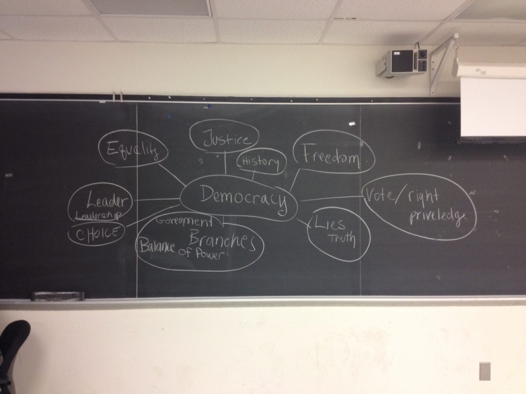
We will continue to use Photoshop to work on the moodboards. Moodboards – also known as your research board should be made in Photoshop – import images into the document from the web, the way I show in class: see handout posted week2. By the end of class your moodboard should be complete and include images from at least four of the categories of the mindmap:
- Complete mind-mapping exercise from last weeks in-class brainstorm on the meaning of ‘democracy’ to help inspire ideas for designing a ‘Get Out the Vote’ poster. See attached picture. You were supposed to expand to include 25 more words.
- Moodboard (DUE end of class) is a research collage to help you determine direction for your poster. A moodboard should show possible color schemes, type choices, relevant imagery and slogans. Should be made in Photoshop. Keep in mind your moodboard should show evidence of your research. Your moodboard should define what a democracy is. I expect to see historical references relating to voting, freedom, government, independence…
- Post a tagline for your Get Out the Vote poster by end of class today – construct a question or brief statement that captures the theme of your mood board.
Lecture Topic
Designing a Poster
- Working with a grid
- Balance – symmetry vs. asymmetry
- Concept Sketches
InClass Presentation
- Paula Scher
Lesson
Continued from last week: Photoshop
-> Resolution 300 dpi vs 72 dpi ( Dots Per Inch = DPI = Pixel = Raster)
-> Setting up/ saving a document
-> Rulers, Layers, Menus, Palettes and Tools
-> Selections
-> Working with layers
-> Layer adjustments
-> Type tool
-> If time allows we will peek at Illustrator
Lab Time
- Work on moodboard. See week2 post for more information about moodboards.
- Break into small groups to construct a 6-8 word question or statement that captures the theme of everyone’s mood board. This question or statement will become the basis for the tagline of your poster.
- Websites that offer permission free and public domain images:
www.sxc.hu
www.richardharringtonblog.com/resources/freeimages/
Homework
Poster Development – 2 pencil or ink sketches of your poster based on the tagline you came up with in class.
- One sketch should be a symmetrical layout
- One should be an asymmetrical layout
- Sketches should show your concept (be prepared to present you ideas to class)
- Sketches must include a hand-drawn border and be a vertical layout (in proportion to the actual poster – just smaller)
For next week I would like you to have a specific target audience in mind and you should be able to explain how your sketches address your target audience and encourage them to go out and vote. For example your target audience could be based on age, economic background, geographic location, gender, etc…
Additional Design Strategies – develop a visual hierarchy of all the required visual elements. Create a few sketches to explore different possibilities for your layout. Think about using type as metaphor to visually communicate your analysis, or point(s) of view on the subject. Experiment with a variety of approaches. Don’t assume first ideas and solutions are the best. Take chances, you can always tighten things up later. Select a series of words from your phrases, edit the words down to a series of syllables, literal meanings have less significance here. Experiment with type and composition perhaps focus on the expression through the letterforms themselves, as well as through their arrangement on the page.
Sketches can be smaller than final poster dimensions but should be a vertical layout. I will review your interim compositions (sketches) next week and from there you will begin to develop one final solution of the poster.
Next week we will review the sketches and begin poster design.

