MARSB
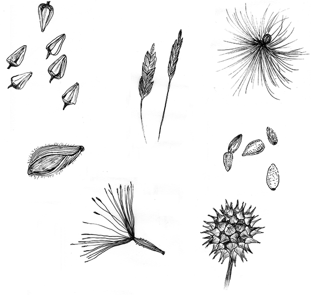
The Mid-Atlantic Regional Seed Bank, is a conservation effort to coordinate efforts to collect and store the region’s native seeds The project entailed working with scientists to help them articulate their target audience and their objectives for the organization’s identity and website.
Responsible For
Art direction, Illustration, and programing
Client
NYC Department of Parks and Recreation


